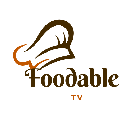

The foodable tv logo appears on streaming shows, articles, and marketing materials. The brand uses the logo to signal food-focused video content. This guide explains the logo’s origin, visual choices, and correct use. It gives clear rules for size, spacing, and file access. The text stays direct and factual to help designers, marketers, and publishers use the mark correctly.
Table of Contents
ToggleKey Takeaways
- The foodable tv logo represents food-focused video content with a bold wordmark and a fork or spoon icon within a screen shape, reflecting culinary and media themes.
- Since its launch, the logo has evolved through updates in 2015 and 2020 to improve readability, color contrast, and adaptability across digital and print platforms.
- Designers must maintain clear space equal to half the icon height and adhere to minimum size guidelines: 24 pixels for digital and 0.5 inches for print use.
- Use the full-color logo on light backgrounds, the white negative-space version on dark backgrounds, and single-color charcoal for limited reproduction scenarios, avoiding unapproved alterations.
- Official logo files are available through the brand’s press kit with strict usage rules including no distortion, no unauthorized co-branding, and proper attribution methods.
- The foodable tv logo is a registered trademark requiring written permission for modifications and co-branding, with the legal team managing compliance and partnership inquiries.
History And Evolution Of The Foodable TV Logo
The foodable tv logo first appeared with the launch of the Foodable network. The team introduced the logo to link video content with culinary expertise. The original mark used a simple type treatment and a small icon. The network updated the logo in 2015 to improve legibility on mobile devices. The 2015 update kept the icon but simplified letterforms and tightened spacing.
In 2020 the brand refined colors and spacing again. The 2020 update aimed to improve on-screen clarity in streaming players. The designers increased contrast and adjusted proportions. The logo gained wider recognition after Foodable expanded into podcasting and live events. The mark now appears on show thumbnails, merchandise, and press materials.
Designers cite the foodable tv logo as a clear example of iterative refinement. The brand kept the core icon and name while improving readability. The logo evolved to match device trends and platform constraints. The evolution shows how the foodable tv logo adapted to new formats while keeping brand continuity.
Design Elements, Color Palette, And Symbolism Explained
The foodable tv logo uses a wordmark and a compact icon. The wordmark uses a bold, rounded sans-serif. The icon uses a simplified screen shape with a fork or spoon motif. The icon links cooking and video in a single mark. The designers chose rounded corners to suggest approachability.
The primary color in the foodable tv logo is warm red. The brand pairs warm red with dark charcoal for text. The color choice signals appetite and energy. The palette includes a secondary warm orange for accents. The color values appear consistently across digital and print files. The team published hex and RGB codes for designers.
The logo’s typography aims for clear legibility. The letter spacing stays tight to form a compact lockup. The icon sits left of the wordmark in the horizontal layout. The icon can also appear above the wordmark in square or stacked layouts. The designers created a negative-space version for light-on-dark use.
The symbolism in the foodable tv logo remains literal and direct. The fork or spoon inside a screen shape reminds viewers of food content on a screen. The rounded letterforms suggest friendly expertise. The warm red color invites attention and action.
Practical Brand Usage Guidelines: Sizes, Clear Space, And Variations
Designers must preserve clear space around the foodable tv logo. The brand defines clear space as one-half the icon height on all sides. The rule prevents crowding by other elements. Designers must not place text or images inside the clear space.
The logo should appear at a minimum width of 24 pixels for digital use. For print, the logo should not appear smaller than 0.5 inches wide. The team recommends larger sizes for signage and video bumpers. The logo must remain horizontal in most uses. The stacked version may appear in square or narrow areas.
Color use follows a precise order. Use the full-color logo on white or light backgrounds. Use the negative-space white logo on dark backgrounds. Use the single-color charcoal logo when color reproduction is limited. Avoid using unapproved colors or gradients on the primary mark.
Designers must avoid common mistakes. Do not rotate, skew, or stretch the foodable tv logo. Do not add drop shadows or outlines that alter letter legibility. Do not change the icon or replace the fork or spoon with other objects. Do not use the logo as a repeating pattern without written permission.
The brand supplies SVG, PNG, and EPS files for approved layouts. The SVG files preserve the icon’s geometry. The PNG files include transparent backgrounds for quick use. The EPS files support high-resolution print workflows.
For social avatars, use the compact icon alone. For thumbnails, use the horizontal lockup with clear space at the top and bottom. For video lower-thirds, use the small white logo on the left edge to keep attention on the host.
The guidelines help maintain consistent recognition of the foodable tv logo. The brand asks partners to follow the rules to protect visual identity.
Legal Considerations, Where To Download Official Assets, And Attribution
The foodable tv logo remains a registered trademark. The owner enforces trademark use to protect brand identity. Partners must not modify the mark without written permission. The brand requires written permission for co-branding uses.
Official assets live on the brand’s press kit page. Designers may download approved files after agreeing to usage terms. The press kit page lists file formats, color codes, and placement rules. The brand updates the press kit when the team changes any assets.
Attribution practices vary by placement. On third-party sites, the brand asks for a short credit line such as “Foodable TV” near the logo. For editorial use, include the logo only with the article title or media caption. For sponsored content, include a short attribution and a link to the brand site.
The brand offers contact information for legal requests. The legal team reviews partnership proposals and co-branding agreements. Designers should contact the brand for custom asset work or trademark questions.
These steps keep the foodable tv logo safe and usable. The brand enforces rules and supplies files to make compliance simple.